AIMS (Assessments and Inspections Management System)
An application designed for Marine Teams to conduct assessments and inspections of assets.
UI design
Ux design
Case study


PROJECT OVERVIEW
Duration -
12months (1year)
Role -
UI/UX Designer
(collaborative project)
Tool -
Sketch, Figma, Miro
Client -
bp (Beyond Petroleum)
User Group -
Assessment & Inspection
Team
ROLES & RESPONSIBILITIES
Scope of work -
User research, User interviews, Online surveys, Competitive analyses & Heuristic evaluation, Customer journey map, User persona, Information archite-cture, Wireframing, Prototyping, Design system.
Team -
Rakesh Roshan, Smriti Shreekumar (Designer) , 12 backend engineers and tester.
PROJECT BACKGROUND
This project focusses on re-building a legacy application that provides a solution to the Marine team to conduct their day-to-day activities involving Assessments and Inspections of assets from end-to-end.
Trading & Shipping in bp involves buying, selling and moving energy, integrating our products and services to provide energy solutions across the world.
The aim is to standardize and streamline the process followed by the entire team to deliver quality reports of the findings from assessments conducted by them.
PROBLEM STATEMENT
The existing iMAS system, which was used for managing inspections in the marine sector, was not optimized for the needs of its users. Marine Coordinators were dealing with a highly disorganized system that presented significant usability issues, such as:
Slow loading times : Users experienced delays in accessing inspection data.
Data overload: All inspection requests were displayed in a single unfiltered feed, making it difficult to prioritize and manage requests effectively.
Manual tracking : Marine Coordinators had to rely on external spreadsheets and manual record-keeping to track progress, which was error-prone and inefficient.
Lack of progress visibility : The absence of a clear and intuitive tracking mechanism for inspections led to confusion regarding where each inspection stood in the workflow.
GOAL
To redesign the legacy iMAS system for BP, improving the management of vessel inspection requests through a streamlined, modernized UI/UX that enhances workflow efficiency, reduces manual effort, and provides better user visibility.
DESIGN PROCESS
User Interviews - Online
Understanding as-is process
Gather expectations/ requirements for the new application
Mapping the journey
Suggesting ways to enhance process
Set the visual language
Design Iterations
Discuss with Development team - feasibility
Approval calls with the SMEs
Design Hand-off for development
User Interviews - OnlineAnalysing and evaluating Developed design
Deliver a major feature / functionality
TARGET USERS
Marine Advisors & Managers (A&I)
Marine Managers
Manage requests across assigned regions, delegate work to the advisors, conduct assessments occasionally and approve the final reports generated.
Marine Advisors
Primary role is to conduct assessments and draft a report.
Requester
Asset owner/manager
Vetting & Clearance
Team responsible for approving the clearance of assets
User Brief
As a part of the Marine Assurance service provided, Assessments and Inspections is a team of 15 - 20 members spread across regions like EMEA, ASPAC and Americas that carry out Vessel Inspections and Company, Terminal Assessment to ensure safety of the cargo and its people.
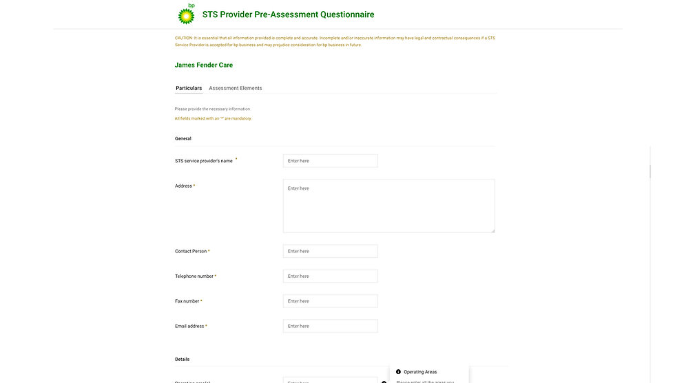
The Legacy Application - iMAS
Understanding the current process followed by the user was an important first step.
We conducted a few calls with the Users to understand how they use the existing applications, and noted the pain points they expressed verbally and sometimes unknowingly.through User Interviews
What they like ?
Flexibility - easy to trick the system.
Every user has a unique workaround to solve a problem - proud of that!
All necessary information pertaining to a particular request can be found in one place
What’s troublesome?
Takes too much time to load
Can’t keep track of the numerous tabs that open up with the opening of every request
A cluttered view of the requests lined up that also has requests that have been raised for a different team altogether
For an overview they created spreadsheets to keep track of the status
Over the time, a lot of information was added but the previous outdated data was never removed
If there’s any technical issue that has to be raised,team takes too long to respond or never responds - hence annoys the user since some activities in the application are time based - rework is required
Flexibility - easy to trick the systemAll necessary information pertaining to a particular request can be found in one place
HOW MIGHT WE....
How might we streamline the process flow, reduce manual interventions, and create an intuitive, visually engaging interface for users?
How might we design the inspection module to align with the overall system yet introduce unique features that cater specifically to inspection workflows?
How might we create a dashboard that effectively manages high volumes of inspection requests while ensuring complete transparency from initiation to completion?
JOURNEY MAPPING
The enhanced user flow for scheduling an assessment.
An Assessment Request is raised via Requestor Portal
It pops-up on the Marine Advisors / Managers dashboard as a task
MA / MM can either assign the task to themselves or to some other team member
After Assigning the assessment an introductory email is sent to the requestor
After sending out the introductory email, the assessment is scheduled.
As soon as they get access to any wifi network they log onto the application to upload their findings
The advisors visit the asset to be assessed and capture their findings via notes / images
After the assessment goes into the ‘In progress’ state, the elements previously selected will be autopopulated in the report editor for the advisor to answer
Once the report is completed, it is submitted to the manager for approval
Manager either approves the report directly or provides comments offline / via email.
Changes are made and resubmitted for approval
Upon approving a final report PDF will be generated which is shared with the requestor and the marine team for further use if any.
Based on the findings some action items might be created to follow up with the requestor

INFORMATION ARCHITECTURE
After analysing and detailed study of the user’s needs and prioritising the service, features required to them, the information architecture was built,


SCREEN BUILDING
Solutions provided to tackle each task in the process of an assessment


Detail Screen
One stop shop for viewing all the information related to an assessment.
Tabs were introduced to neatly organise the information and not overload the user.
CTA’s for quick actions originating from the information displayed on the screen


Action Tracking
For every category based findings identified by the assessor, an action item is created for a V&C team member (another user group) to investigate and follow up to close the observation made initially.
AIMS on caters to report creating and are responsible to mark action items as closed.
The tasks related to the action item are conducted by the V&C (Vetting and Clearance) separately offline, and upon completion the assessors are notified through offline communications.
Replacing assessors
If an assessor can’t make it to the assessment due to a sickness or any emergency leave, users should have the ability to replace the original assessor with an available one.


DASHBOARD
Creating a responsive & interactive design along with capability of handling large volumes of Inspection requests
Users are used to seeing this data in a tabular format, with a lot of unnecessary details, resulting in an overload of information.

What it initially used to look like
Handling multiple request with no clear distinction between different types of assessments & inspections.
Unorganised way of handling data
vs
The re-designed Dashboard
Organised request to understand progress at each stage
Applicable filters based on the section of Dashboard the user is in
Visual clarity & differentiation among Inspections & assessments, combination requests etc.

MARINE CALENDER
A calendar that enables the user to look for available inspectors for an inspection along with the details of the inspectors segregated by the region.
This allows the user view the inspector’s schedule with respect to his assigned inspection request, log in holidays.
A lot of shortcut keys were used on this screen to log multiple things on the calendar. Colour coding eventually wasn’t relevance.


What it initially used to look like
Multiple filter and sorting options that hold no value at present.
Shortcuts like Ctrl+Double click to open a particular request.
'Booking colours' is no longer needed.
Shift+Double click to log unavailable time
Details of Inspector & Inspection Company not accurately presented.
vs
The re-designed Marine Calendar
Organised request to understand progress at each stage
Applicable filters based on the section of Dashboard the user is in
Visual clarity & differentiation among Inspections & assessments, combination requests etc.


DESIGN IDEATION
With the research and design direction in place, we moved on to low-fidelity wireframes to visualize the core structure and layout of the application. The goal was to create a visual framework that would address the following:
Simplify the User Interface: The interface needed to be less cluttered, with only the most relevant information visible at any time.
Intuitive Navigation: The navigation should be clear, with easily identifiable categories like inspection requests, inspector availability, and completed reports.
Task Focused: The design needed to prioritize the tasks users were performing most frequently, such as assigning inspectors, tracking request status, and viewing reports.


Thanks for checking out this project!
See how I tackled a different design challenge in other projects. Let me know what you think! I'm always looking for feedback."
USER TESTING & REFINEMENT
Usability Testing
Before finalizing the design, we conducted a round of usability testing with a small group of Marine Coordinators and Inspectors. They interacted with the high-fidelity prototype, and their feedback was used to refine the design.
Feedback from Testing
- Users appreciated the cleaner layout and the ability to see everything at a glance on the dashboard.
- The Marine Calendar received positive feedback for its intuitive design, as users found it easy to schedule and manage inspections.
- There was a suggestion to make the task completion confirmation more prominent to avoid accidental submissions.
Refinements Based on Testing
- Added a confirmation prompt for submitting completed inspections and reports.
- Tweaked button sizes and spacing for better click accuracy, especially for users on tablets or mobile devices.
- Enhanced the status indicators (e.g., progress bars, color-coded labels) to improve visibility of inspection progress.
FINAL DESIGN & HANDOFF TO DEVLOPMENT
Design Handoff
Once the final designs were approved, we prepared the handoff package for the development team, which included:
- High-fidelity mockups of all key screens.
- An interactive prototype to show the flow of user interactions.
- Design specifications (e.g., colors, typography, spacing) documented in Zeplin, ensuring that developers could implement the designs accurately.
- Detailed user flows to guide the development team through each step of the user interactions.
During the handoff, I worked closely with the developers to answer any questions, clarify design decisions, and ensure that the UI was implemented as envisioned.
User Feedback & Iteration
After launch, I continued to gather feedback from users to identify any areas that required further refinement. This included monitoring user behavior and collecting data on key performance indicators (KPIs)

INSPECTORS
Adding a new inspector, activating/deactivating existing ones, updating their details, all in a single screen.
Multiple screens had to be visited to perform actions on an inspector.

What it initially used to look like
Outdated field inputs.
Insufficient user feedback.
Recognition of general user behaviour is lacking in the design language followed easier.
vs
The re-designed Inspector Detail screen
Intuitive Active / Inactive states for Inspectors.
Concise and clear presentation of data, progressive cognitive load
Inspectors access via dashboard with immediate access to important details

Re-assignment of elements & assessors
With 2 assessors on the job, it’s frequent for User A to complete the assigned work whereas User B might take up more time than anticipated. At this point, User B should be allowed to delegate some more work to User A in order to stay within the desired timeline.

.png)


